Avoiding Layout Shifts Caused by Disapearing Scrollbars

Here is the situation: You need to prevent scrolling on you main content when a certain element becomes visible. Probably a modal1 or a sliding burger menu.
You easily achieve this by setting overflow:hidden; on the element which must be temporarily
unscrollable, probably the <body>.
But now you have an unpleasant visual effect, demonstrated in the CodePen below:
As you can see*, the content behind the modal is shifting.
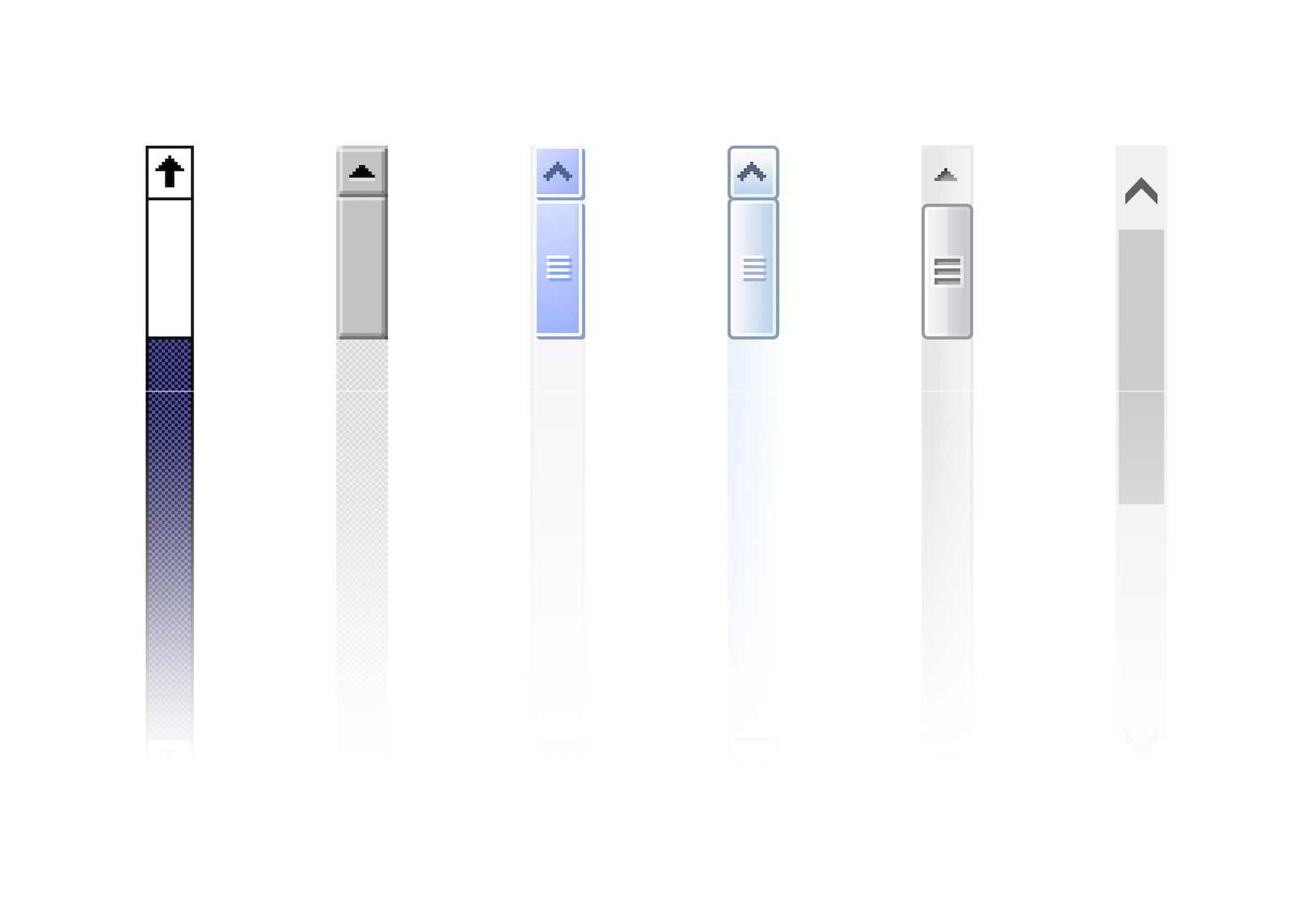
This happens because when we set overflow:hidden on the <body>,
the scrollbar disapears and the content adjusts to a new width.
(A new document.body.clientWidth, to be exact.)
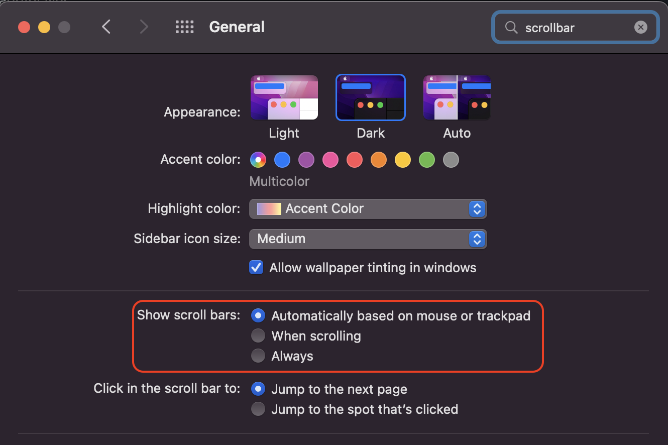
*If you cannot see it, scrollbars must be automatically hidden by your OS. The setting looks like this on Mac and must be equally to find easy on Linux and Windows.

Prevent content shifting by replacing the scrollbar with padding
Simply add padding as wide as the scrollbar before it disapears and remove that padding when the modal gets closed. 🪄
There is no such thing as document.getScrollbarWidth and scrollbars are not all
created equal; 15px wide on Chrome, 12px on Edge, 0px on my phone…
But you can get the scrollbar width easily with this single line of JS:
// For a live demo, copy and paste this in the console
window.innerWidth - document.body.clientWidth
With that precious information, all that’s left to do is set a padding on the body.
// on open
document.body.style.paddingRight = `${
  window.innerWidth - document.body.clientWidth
}px`
document.body.style.overflow = 'hidden'

// on close
document.body.style.paddingRight = '0'
document.body.style.overflow = 'unset'
And our modal can now open gracefully, without any nonsense in the background:
Don’t bother looking at the HTML and CSS of these CodePens, the magic happens in the
openModal and closeModal functions.
“modal”, “dialog”, “popup”, “popover”… I’ll stick to “modal” here. ↩︎